R projects
Assignment calendar with highcharter
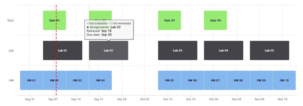
As part of the custom websites I build for each of my courses, I have a calendar visual that displays the start date and due date for each assignment in the class. I wanted to give my students an easy reference for when assignments are going to come due, and I was inspired by the common Gantt chart visual. Every day of the semester is represented on the X axis, and the Y axis is grouped by assignment types (quizzes, labs, homeworks).
To create this, I used the highcharter package, which supports greater interactivity than your standard base R and ggplot visuals.
Beyond the basic visual, I added a couple of elements I thought would be helpful:
- A vertical red line indicating the current day.
- A semi-transparent tooltip that appears when the student hovers over a specific assignment, displaying the release date and due date.
The only thing I don’t like about this is how the numeric representation of each assignment’s release date and due date is included in the tooltip on the very top line (where you can see “17581536000000 - 17591904000000”). But as long as you don’t pay attention to that, I think this is a great resource for my students.
Here’s the R code (click to expand):
Cat Scheduler Dashboard
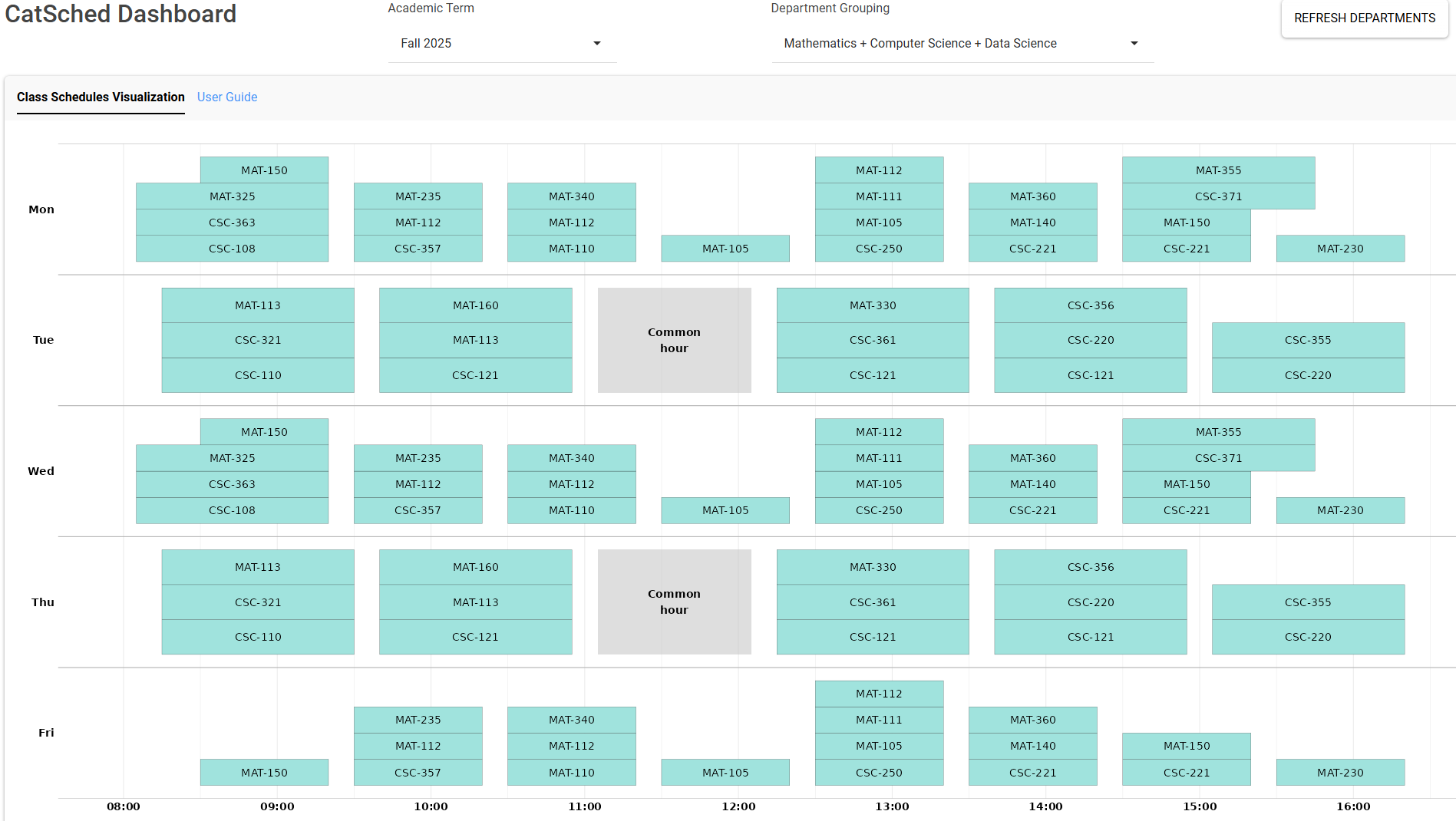
This is an interactive dashboard I built in R Shiny for department chairs and Academic Affairs staff at Davidson to visualize the planned course schedule for upcoming academic years. Professors have an application they can access (called “Cat Scheduler”, abbreviated as “CatSched”) where they submit their day, time, and location preferences for the courses they’re going to teach, as well as equipment, layout, and other classroom features.
After they submit these preferences, the Cat Scheduler algorithm (developed by my colleague Dr. Laurie Heyer) tries to build an optimal course schedule for the entire college based on the availability of classrooms and the preferences of the faculty. After this schedule is built, my dashboard visualizes the results so the faculty (particularly the department chairs) can make adjustments, specifically so they can try to distribute their classes somewhat evenly throughout a given week in the hopes of spreading out the demand for shared college spaces and resources.
Users can select the semester they want to review, as well as the “department group,” which helps group together courses from different disciplines according to some logic from the Registrar’s office that I never fully understood, but I think has to do with them often sharing the same buildings. But I could be wrong.
The data comes from the CatSched API, a REST interface that sits on top of MongoDB. It refreshes automatically when a user loads the dashboard, but I also included the “REFRESH DEPARTMENTS” button in the upper-right corner in case someone wants to query fresh data from the API while they’re reviewing a particular department group.
Another cool aspect of this is the embedded user guide, which gives users a quick walkthrough of how to navigate the dashboard.